
Landing page · ASU

WAT Landing Page
WAT, the Writing Analytics Tool, is built for teachers and students. I designed its public landing page so every section answers a stakeholder requirement, and the layout adapts to every screen size.
TEAM
Me, a project manager, a software engineer
TIMELINE
Jun 2025
TOOLS
Figma · FigJam
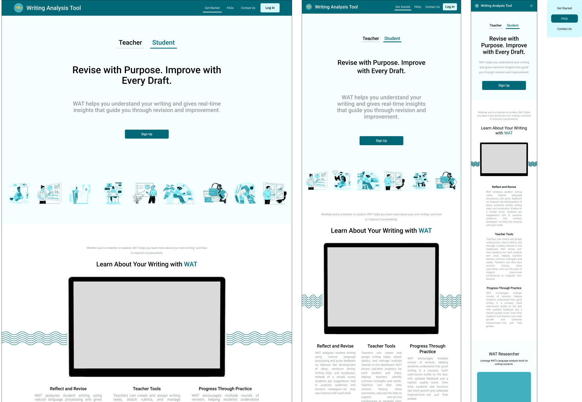
Figure 1. The page on desktop and tablet beside the phone layout with its menu open, with a gray placeholder where the product video goes.
The brief.
The team needed a landing page that explains the product. Stakeholders asked for brand presence through the tool’s own color guide, a clear call to action across the page, and a layout that holds up on tablet and phone.
I owned the design work. That covered the information architecture and section strategy first, then a style guide, then high-fidelity responsive screens and the developer handoff. My goal was a page where every section has one clear purpose and asks for as little reading as possible.
One hero, two audiences.
Stakeholders wanted the hero to speak to teachers and students, keep a single clear call to action and show the product’s value in one screen. I used two tabs, Teacher and Student, each with its own headline and one-line subhead, and the same Sign Up button under both.
I explored several hero layouts before settling on the tabbed version. On phones the tabs sit above a single headline and the Sign Up button.
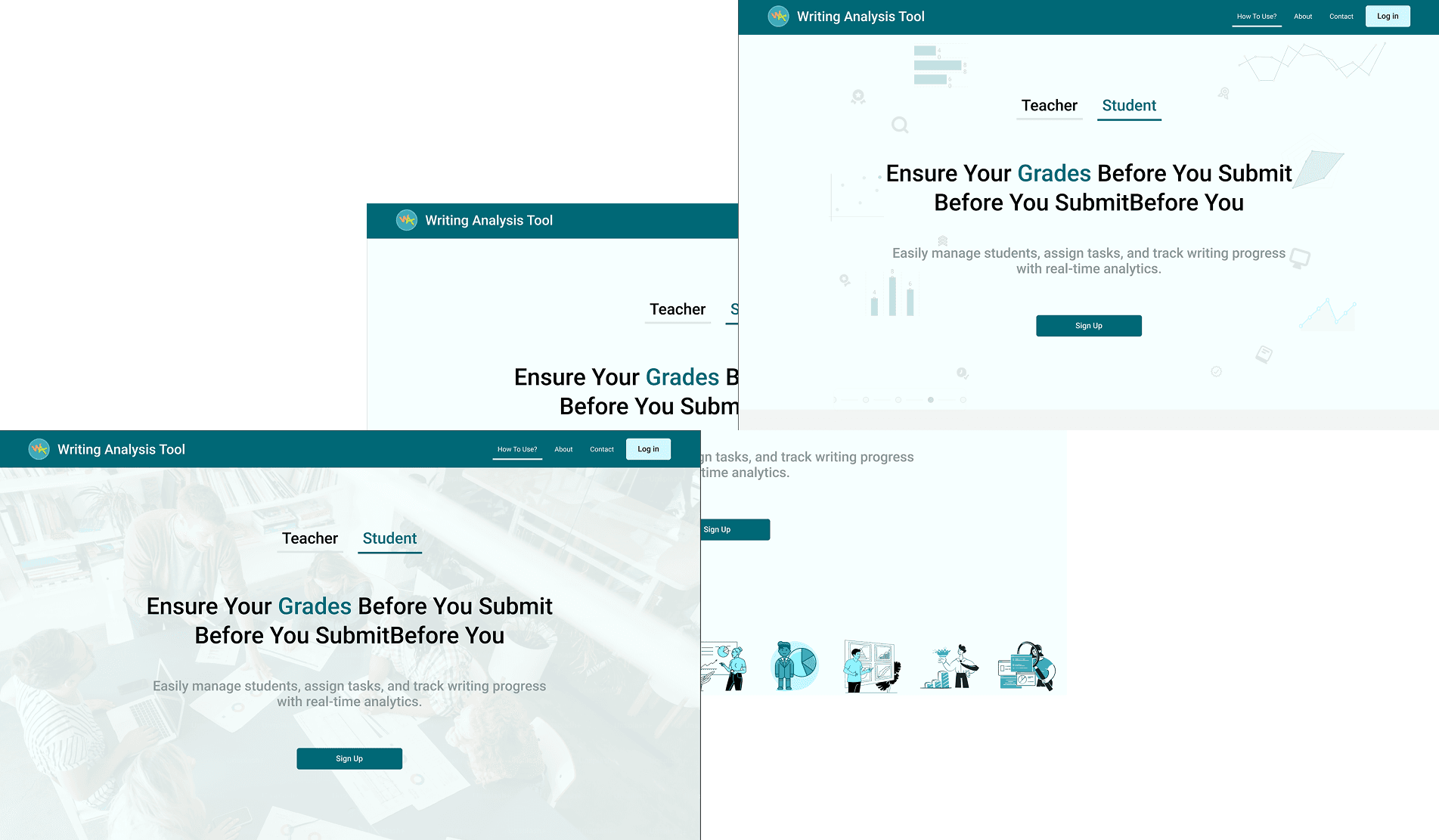
Figure 2. Hero explorations with the Teacher and Student tabs.
Section by section.
The design file records each section’s stakeholder requirement, my design choice and the iterations behind it.
Navbar
A compact bar with the logo, anchor links to Get Started, FAQs and Contact Us, and the primary action on the right. On phones it collapses into a hamburger menu.

Figure 3. Navbar spec with the active-section state and the log-in action.
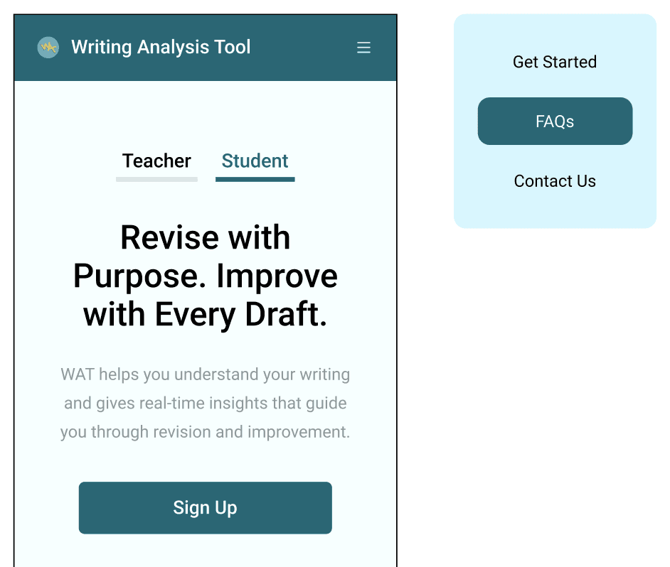
Figure 4. The phone navbar collapsed into a hamburger, with its menu open beside it.
How WAT works
The section opens with one line for teachers and students and a slot for a product video. Below it, three cards named Reflect and Revise, Teacher Tools and Progress Through Practice each explain one part of WAT in a few lines. On phones the cards stack in a single column.
WAT Researcher
WAT has a research sibling, WAT Researcher. It gets its own band below How WAT works, with a one-line pitch and separate links to the web app and the desktop app.
About
The About section explains who WAT serves, with a short paragraph each for students, teachers and researchers, then credits the teams at ASU’s Learning Engineering Institute and SoLET Lab and their partners at the University of Minnesota and Vanderbilt.
FAQ
The FAQ holds seven questions, from what WAT is and how to get started through to data privacy and cost, with a short answer under each.
Footer
The footer sends people to support through the LEI contact form, points researchers to WAT Researcher and credits the IES grant that funds WAT.
Built on the product’s style guide.
I built the page on WAT’s own color roles, type tokens and spacing scale, so it keeps the tool’s branding and hands the engineer values that already exist.
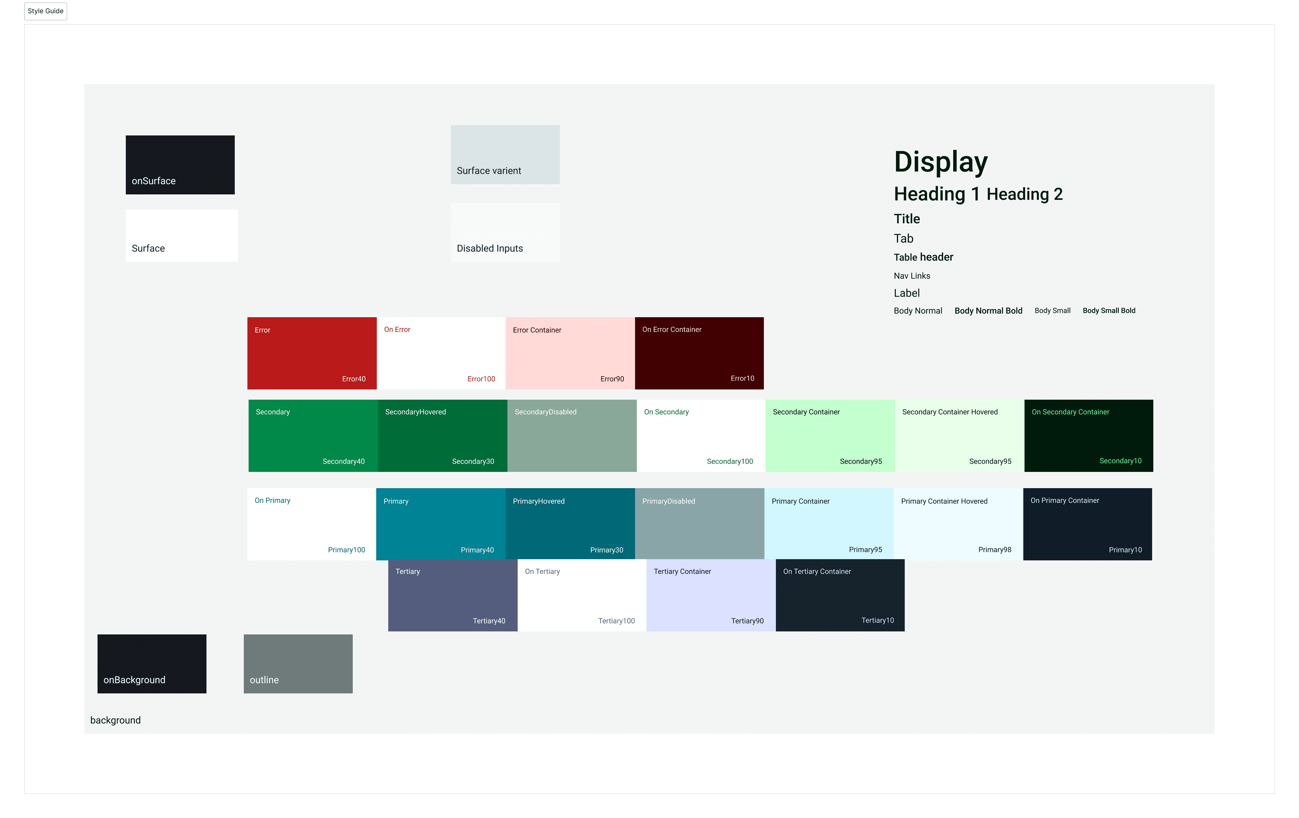
Figure 5. The style guide the landing page reuses: color roles and the type scale.
Clickable prototype.
I designed the desktop, tablet and phone layouts together, so the stacked cards, segmented tabs and collapsed menu were settled before handoff.
Project takeaways.
Anchal Nagdev