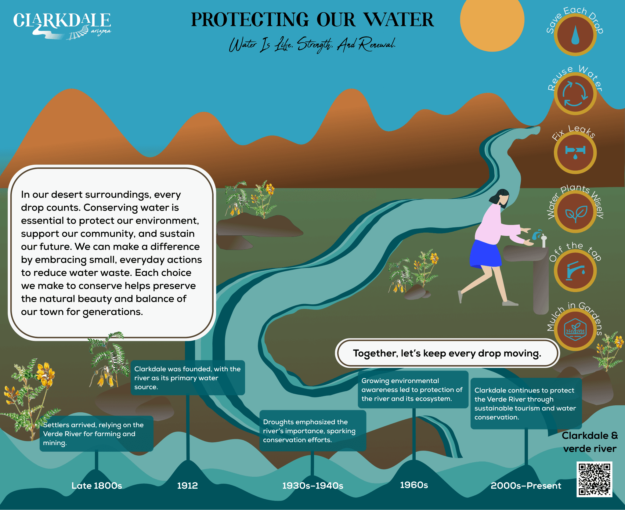
Figure 1. The final sign, “Protecting Our Water.”
EDUCATIONAL SIGNAGE · CLARKDALE, ARIZONA
Park Signage
I designed educational signage for the $2.5 million renovation of Selna Mongini Park in Clarkdale, Arizona. The signs make STEAM learning playful for visitors of all ages, with the Verde River and water conservation at the center.
TIMELINE
Fall 2024, 10 weeks
FOCUS AREA
Arts
PARTNER
Town of Clarkdale
The brief.
In my first graduate semester, my technical communication class partnered with the team behind the park’s renovation. The new park would center on STEAM learning (science, technology, engineering, arts and math), so the class split into teams by focus area. I picked Arts because I wanted the most creative part of the brief.
The Arts team was asked to represent the area’s Native history and the Verde River, which runs close to town and has long sustained the people who live there.
Goals
Engage visitors with Clarkdale’s history and its sustainability work.
Create site-specific STEAM content, led by the arts.
Represent the town through its brand colors and typography.
Audience
The signs had to work for local families with young children and for eco-conscious visitors passing through.

Local families
Children

Eco-conscious visitors
Figure 2. The three audiences the signs were written for.
Research.
Annotated bibliography
I reviewed more than 30 articles and case studies on educational signage, accessibility and how communities engage with public spaces.
Field visit
On a visit to the park I mapped how visitors move through the space and picked out the spots where signs would be seen most. I also watched how families used the park.
Community profile
Clarkdale families care about safety and environmental education, and they take pride in their town. Sustainability matters here too, with water conservation and reuse high on the list, so the signs had to reflect those shared values.
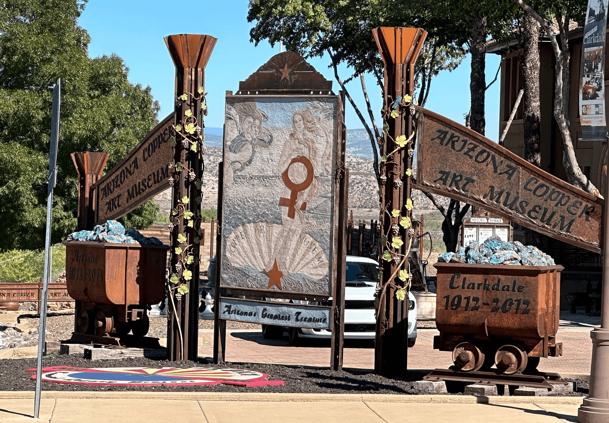
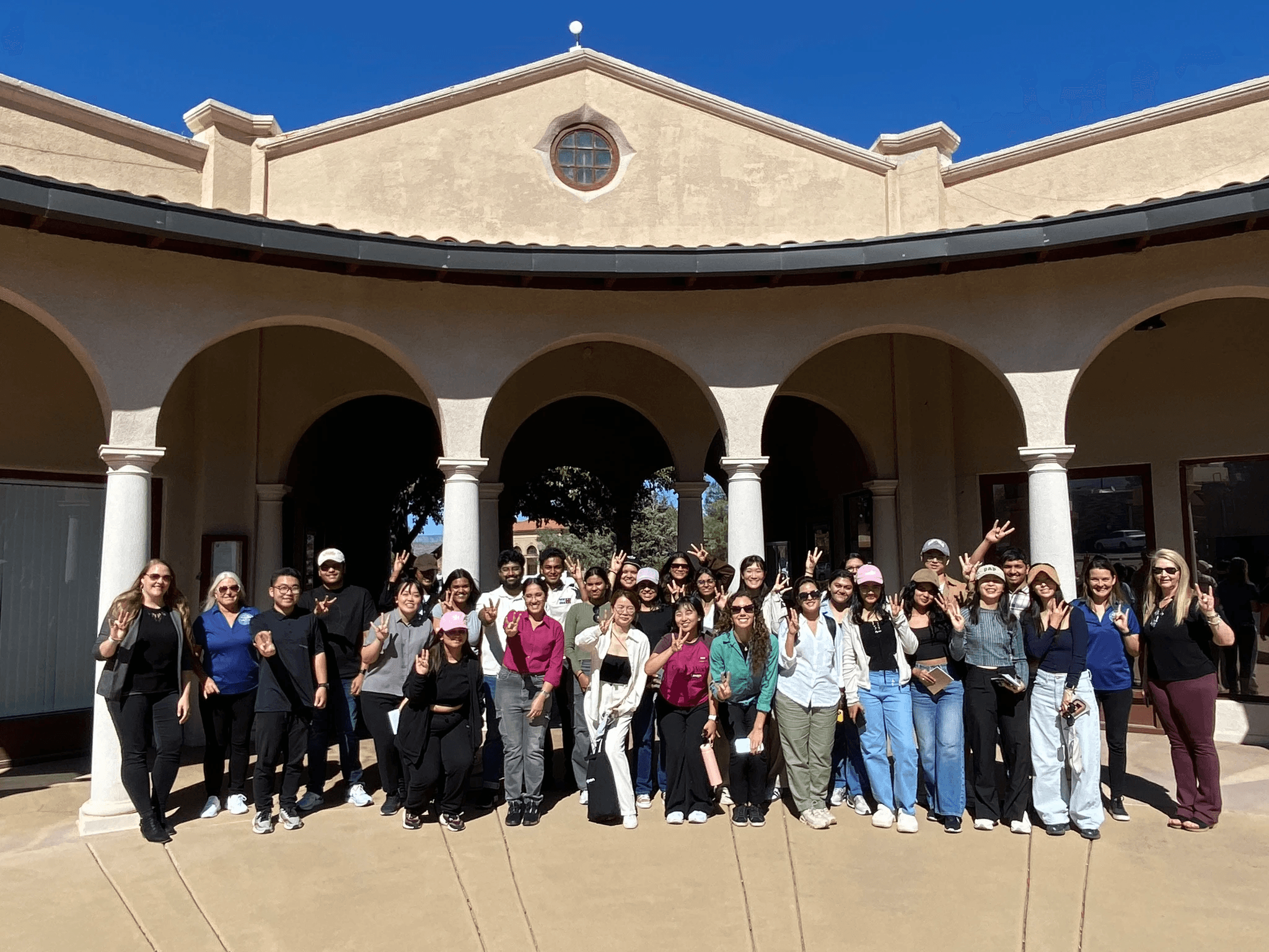
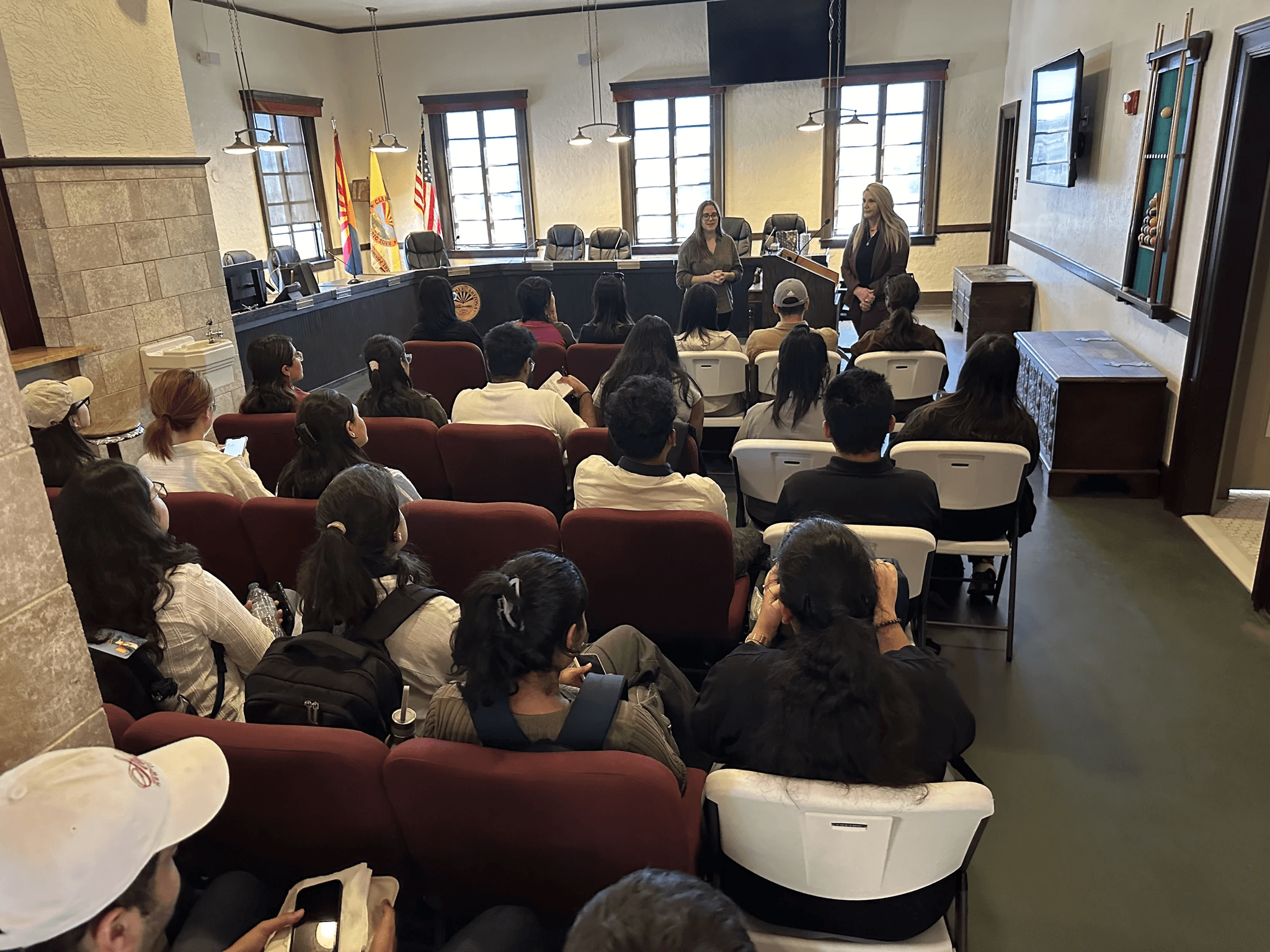
Figure 3. Photos from the class field visit to Clarkdale and the park.
Working inside the town’s brand.
Clarkdale’s brand guidelines rest on six pillars: nature, history, local culture, vision, mission and color. Every sign I designed stays inside those guidelines.
Color: blues, greens, earthy reds and copper, taken from the desert and river around town.
Typography: Rolate for heritage, Abuget for taglines and Nexa for body text.
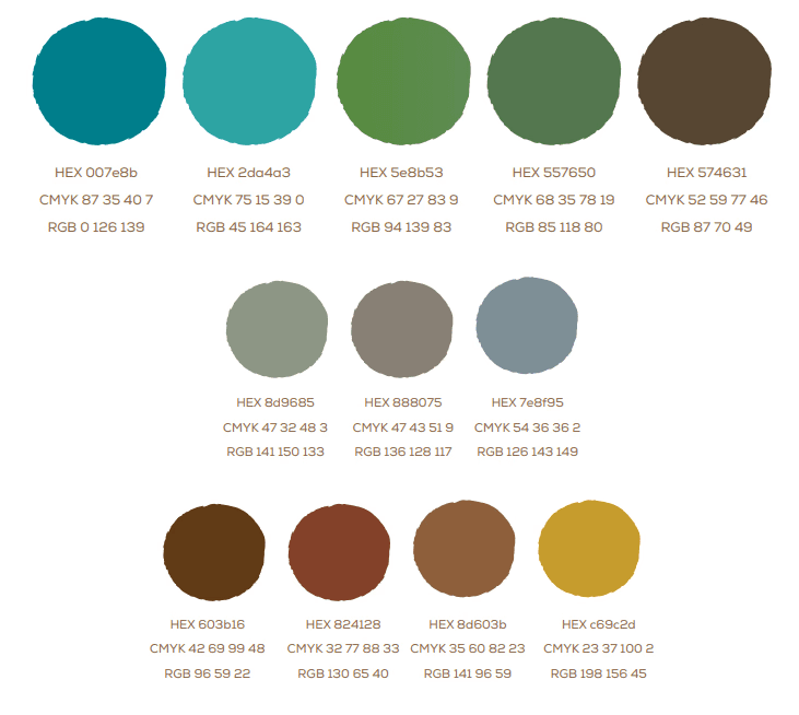
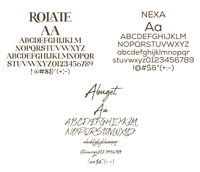
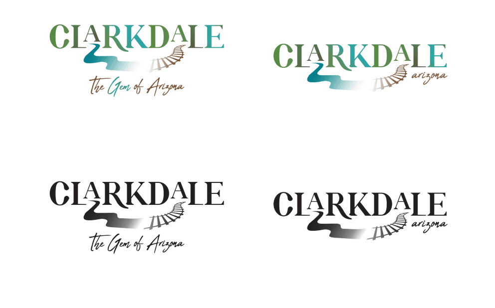
Figure 4. The Clarkdale brand kit I worked from: palette, typefaces and four versions of the logo.
The first draft.
I sketched and prototyped family-friendly signs built on:
Vivid illustrations and icons
Clear, approachable language
An interactive water conservation timeline
Stories and facts about Clarkdale’s history and the Verde River
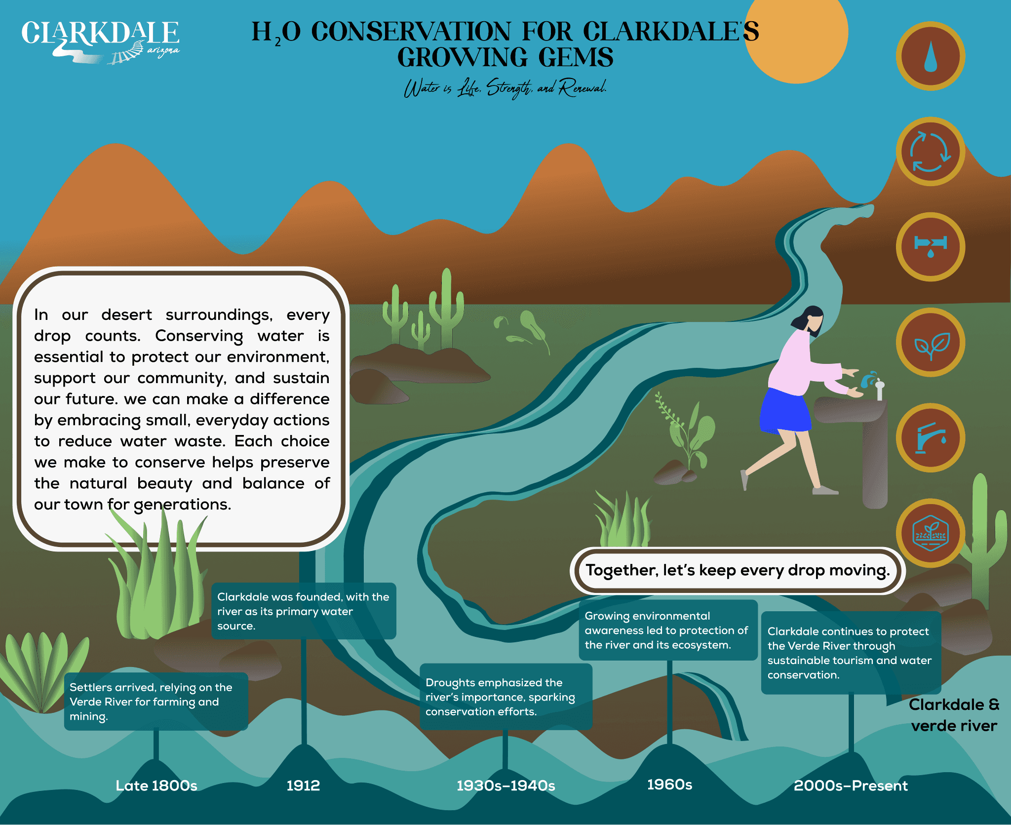
Figure 5. The first draft, “H₂O Conservation for Clarkdale’s Growing Gems.”
Testing with eye tracking.
I tested early prototypes with families and older adults using Tobii eye tracking. Each session looked at:
Ease of learning: whether titles, icons and layouts could be read at a glance
Navigation: how the content flows across the sign
Accessibility: contrast, type size and how clean each layout felt
Durability and upkeep: weather-resistant materials and easy content updates
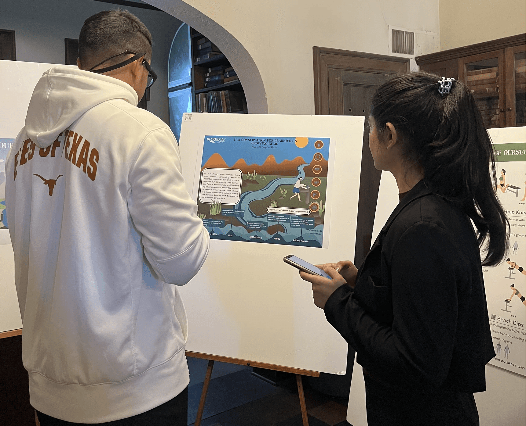
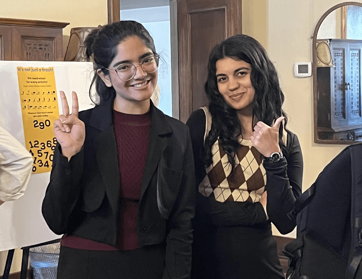
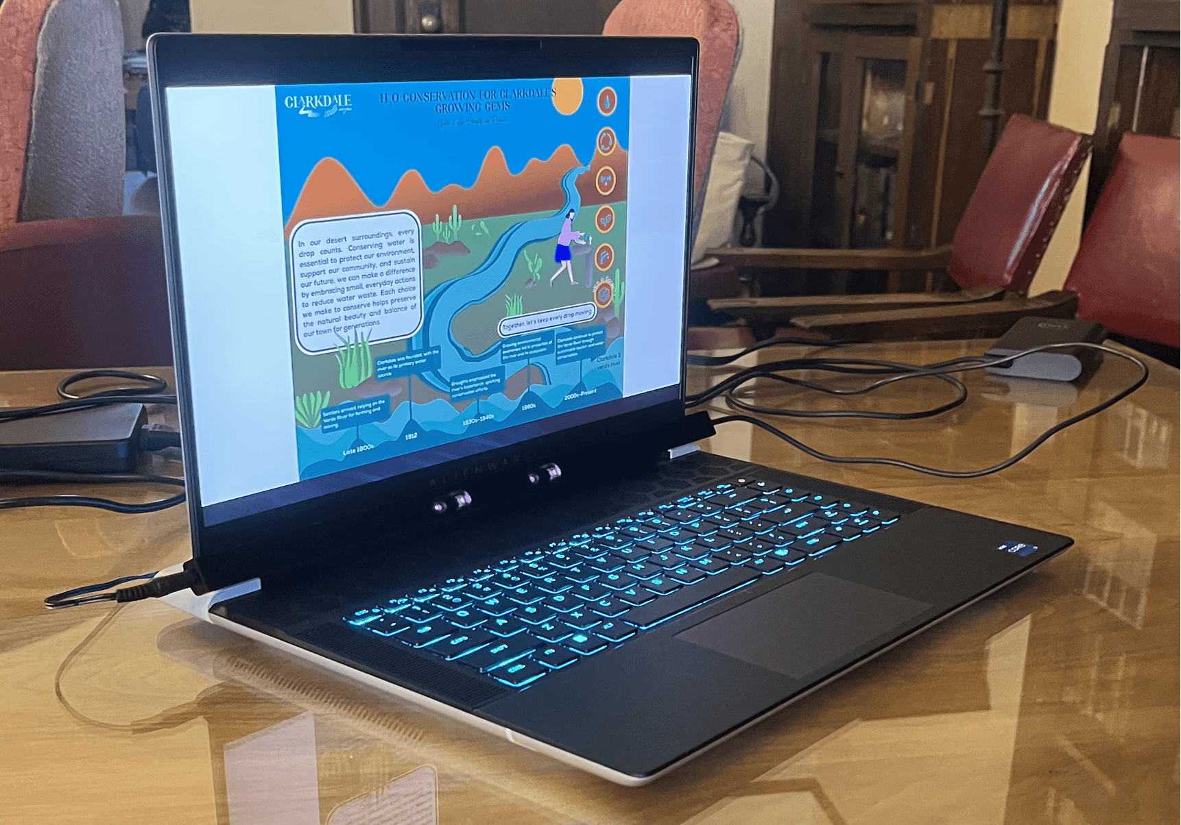
Figure 6. Photos from the testing sessions with printed and on-screen drafts.
What changed after feedback.
Stakeholder feedback led to four changes:
A new title, “Protecting Our Water”
Native plant illustrations, with mesquite in place of saguaro
Accessibility fixes to the text and typography
QR codes that link to STEAM activities

Figure 7a. The first draft, with each problem marked.

Figure 7b. The revised sign, with each change marked.
The final sign.
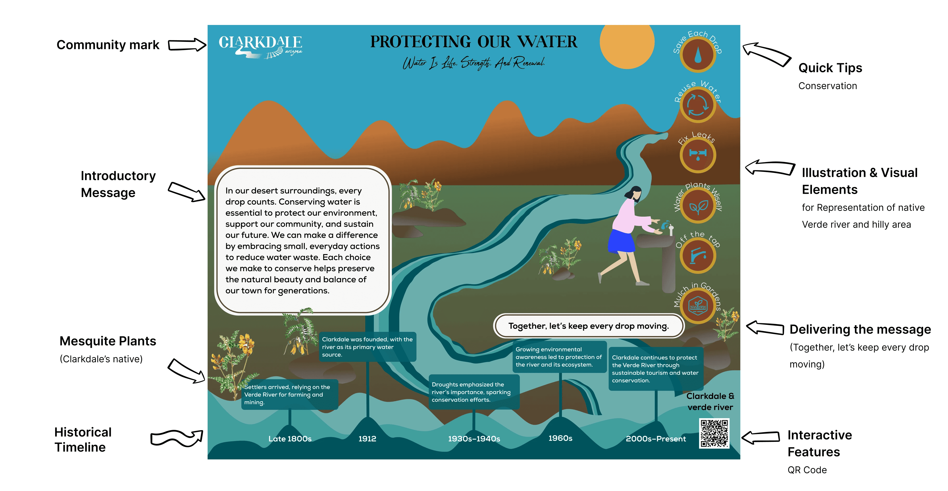
Figure 8. The final sign, with each of its design elements annotated.
I presented the final designs to the Town of Clarkdale.
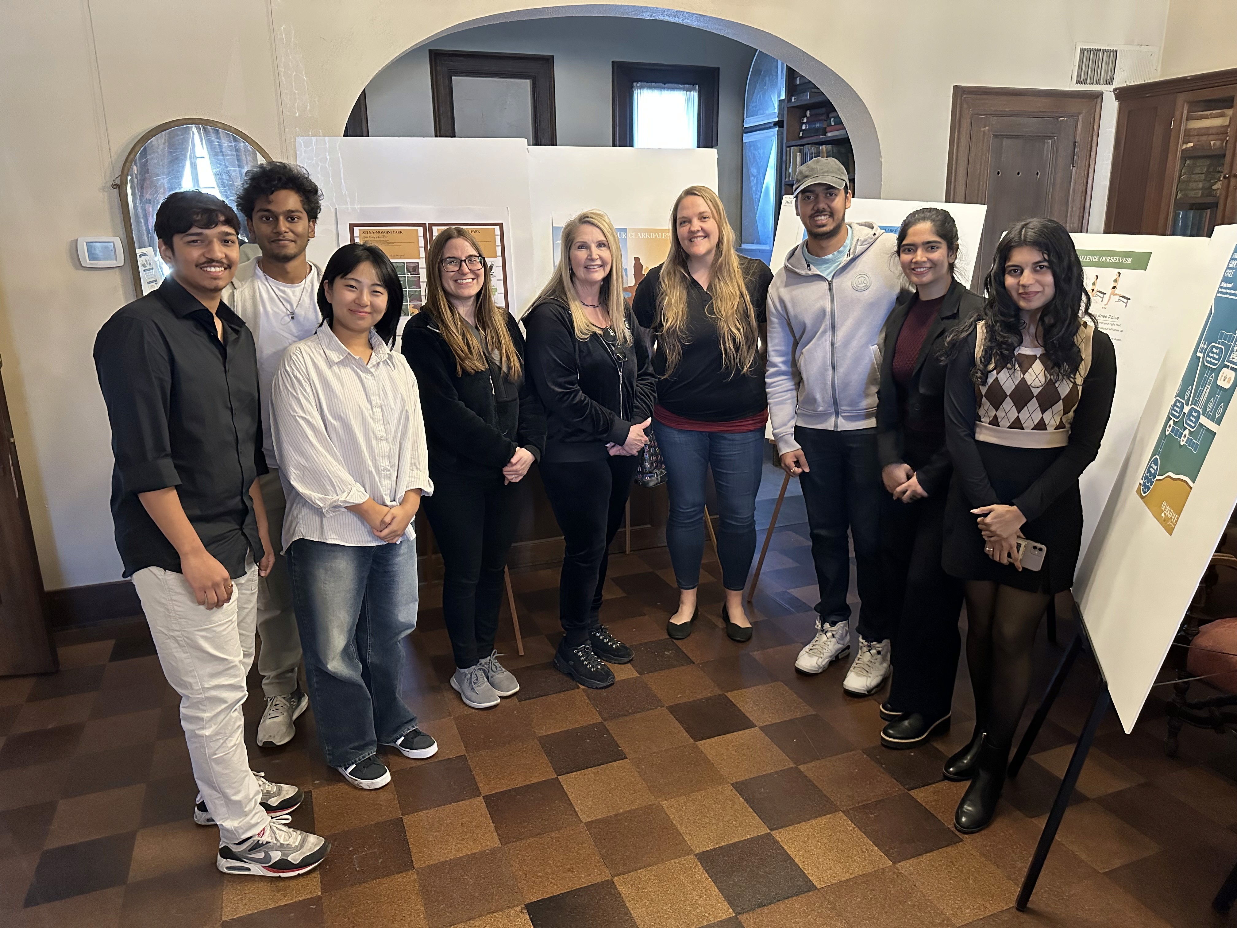
Figure 9. The project team with the final sign boards on display.
Project takeaways.
Next case study
Baywatch, a coastal surveillance UAV
Read the case study →
Anchal Nagdev