
Web app · Team of 3
TripWise
TripWise is a budget-first trip planner for solo and group travelers. You set a budget and a route, and TripWise plans the whole trip around those two inputs. On a team of three with Manish Durgude and Atharva Ruikar, I owned the research and the UX design and built the working web app.
TEAM
Anchal Nagdev, Manish Durgude, Atharva Ruikar
TIMELINE
May to Jul 2025
TOOLS
Figma · Maze · Google Forms · ClickUp
Planning one trip took a pile of tools.
Travelers planned a single trip across Google Maps, Skyscanner, Booking.com, TripAdvisor, YouTube and a group chat. Each tool held one piece, so nobody saw the whole plan or its total cost.
People told us about decision fatigue from options spread across sites, budgets that ran over because spending lived in several places, group plans that broke down, and good options they missed because the information was scattered.
Interviews first, then a survey.
We ran user interviews through Maze to check whether trip planning was a real problem. Then 23 travelers answered a Google Forms survey that tested what we heard, and five patterns came through.
Once or twice a year
About half of the people we surveyed travel once or twice a year.
Tool fragmentation
They pieced each trip together from Google, Skyscanner, TripAdvisor and YouTube, which made planning slow and tiring.
Traveling together
Most preferred traveling with family or friends.
Budget comes first
Participants looked for cost-effective options and wanted an estimate of the total before booking anything.
Low trust in current tools
People were frustrated by inaccurate reviews, misleading information and booking spread across sites.
Six competitors, compared feature by feature.
We compared Wanderlog, Trip Planner AI, Wonderplan, Stippl, Roadtrippers and Rome2Rio across trip planning, budget, AI, transport and collaboration. Most were strong in a few areas and weak in the rest. None combined AI suggestions, budget-first planning, multi-modal transport and group collaboration in one product.
Two more gaps stood out. Travelers didn’t trust existing reviews, and few tools adapted to a solo trip versus a group trip.
Lisa and Jack, our two personas.
Research synthesis gave us two primary personas. Lisa travels with family, plans around ticket prices and wants one trustworthy place to plan. Jack travels solo and wants personalized suggestions and a clear cost breakdown before he books.
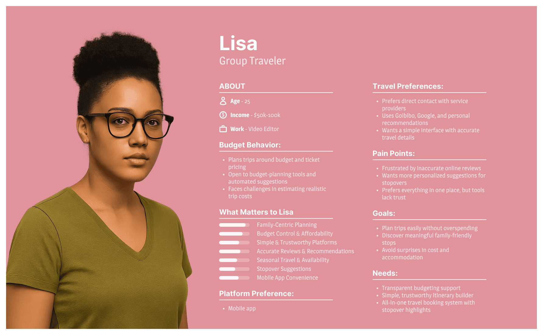
Figure 1. Lisa, a group traveler who plans family trips around ticket prices.
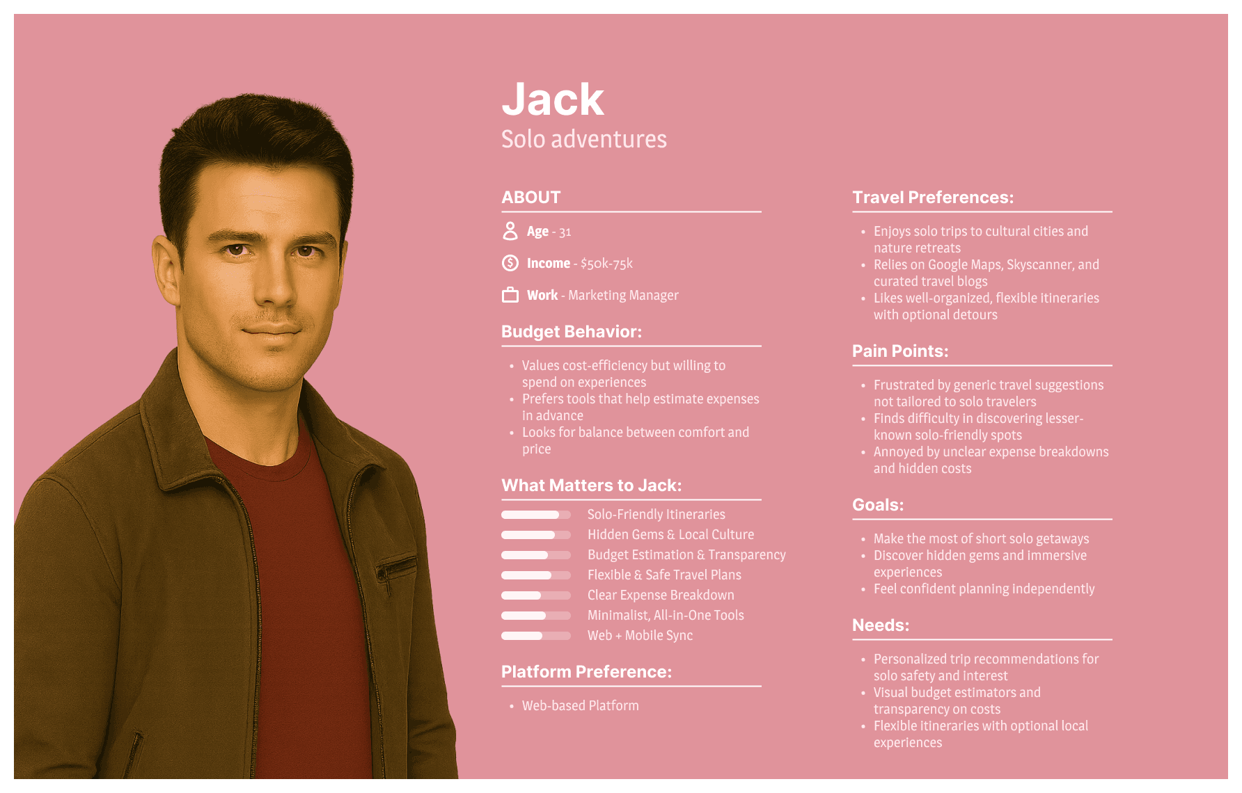
Figure 2. Jack, a solo traveler who wants suggestions that suit one person.
How might we give group travelers like Lisa and solo travelers like Jack one trusted place to plan a trip, with the cost visible from the start?
Card sorting set the navigation.
Six participants sorted 31 travel tasks into groups. Seven of their eight groups became the app’s main navigation. Itinerary was the exception, and we folded it into Plan and Budget as a tab.
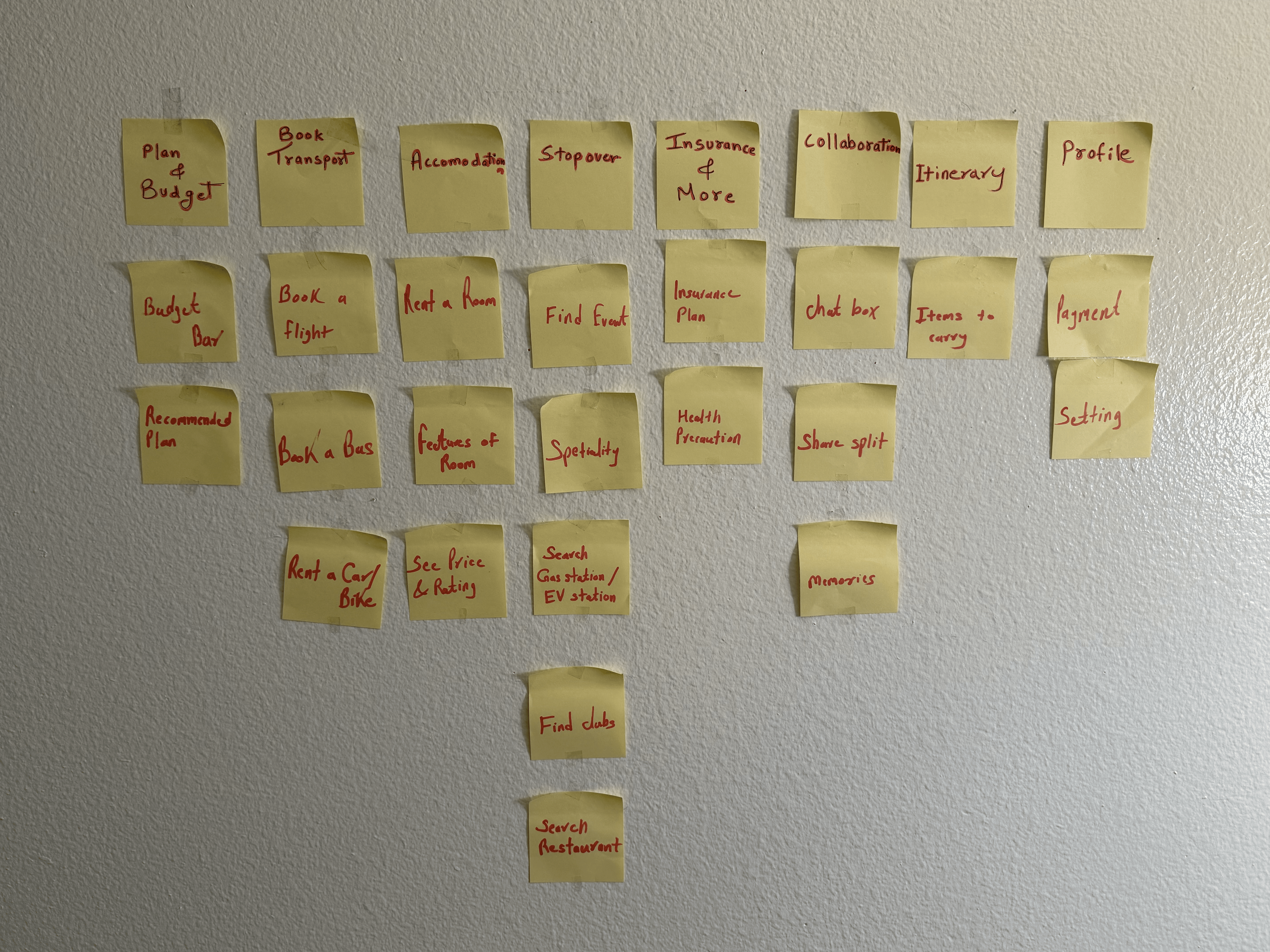
Figure 3. The card sort, with sticky notes grouped by the participants themselves.
Wireframes for every tab.
We wireframed each section of the sidebar before visual design: plan and budget, transport, accommodation, stopovers, packing, insurance, collaboration and profile.
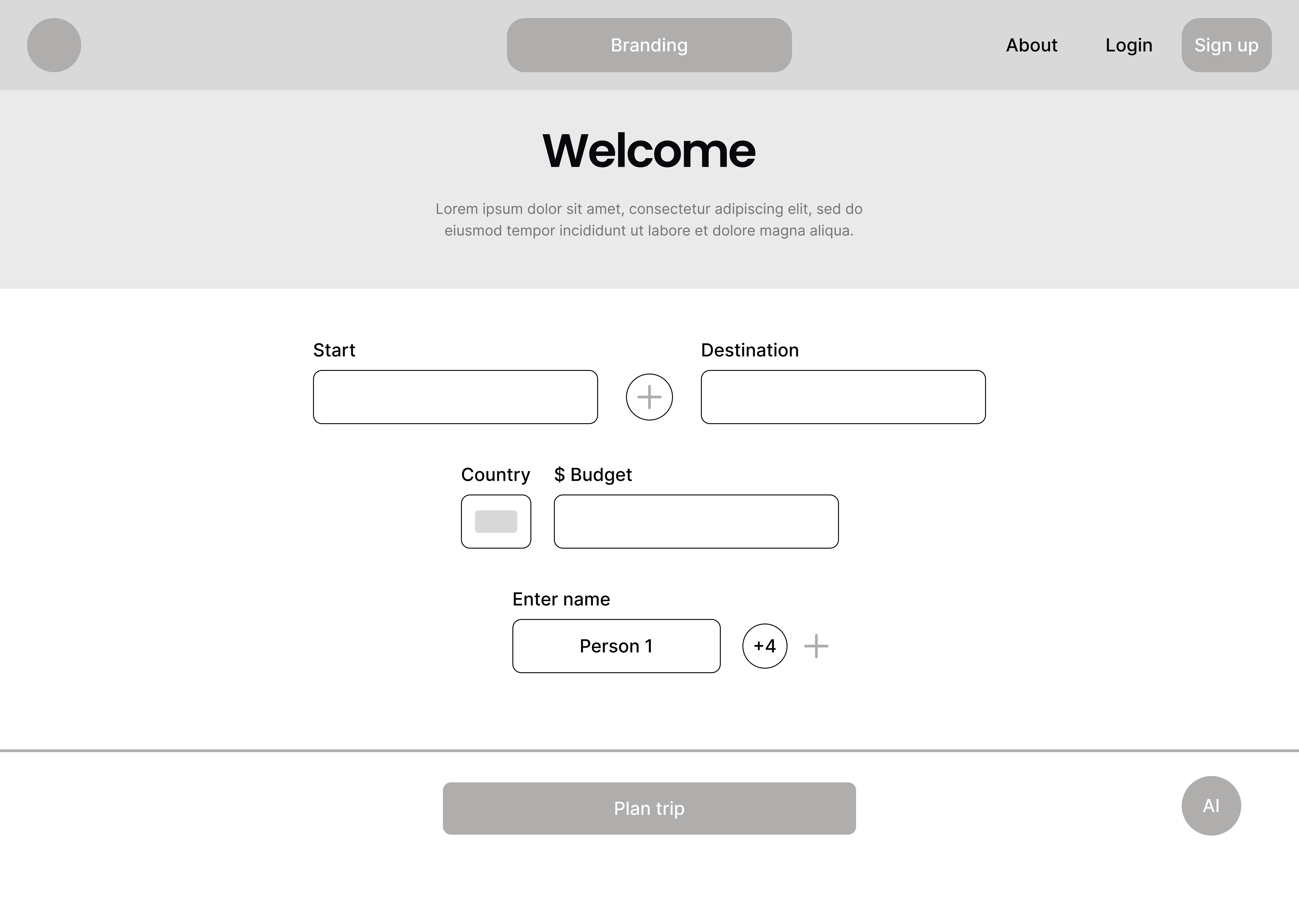
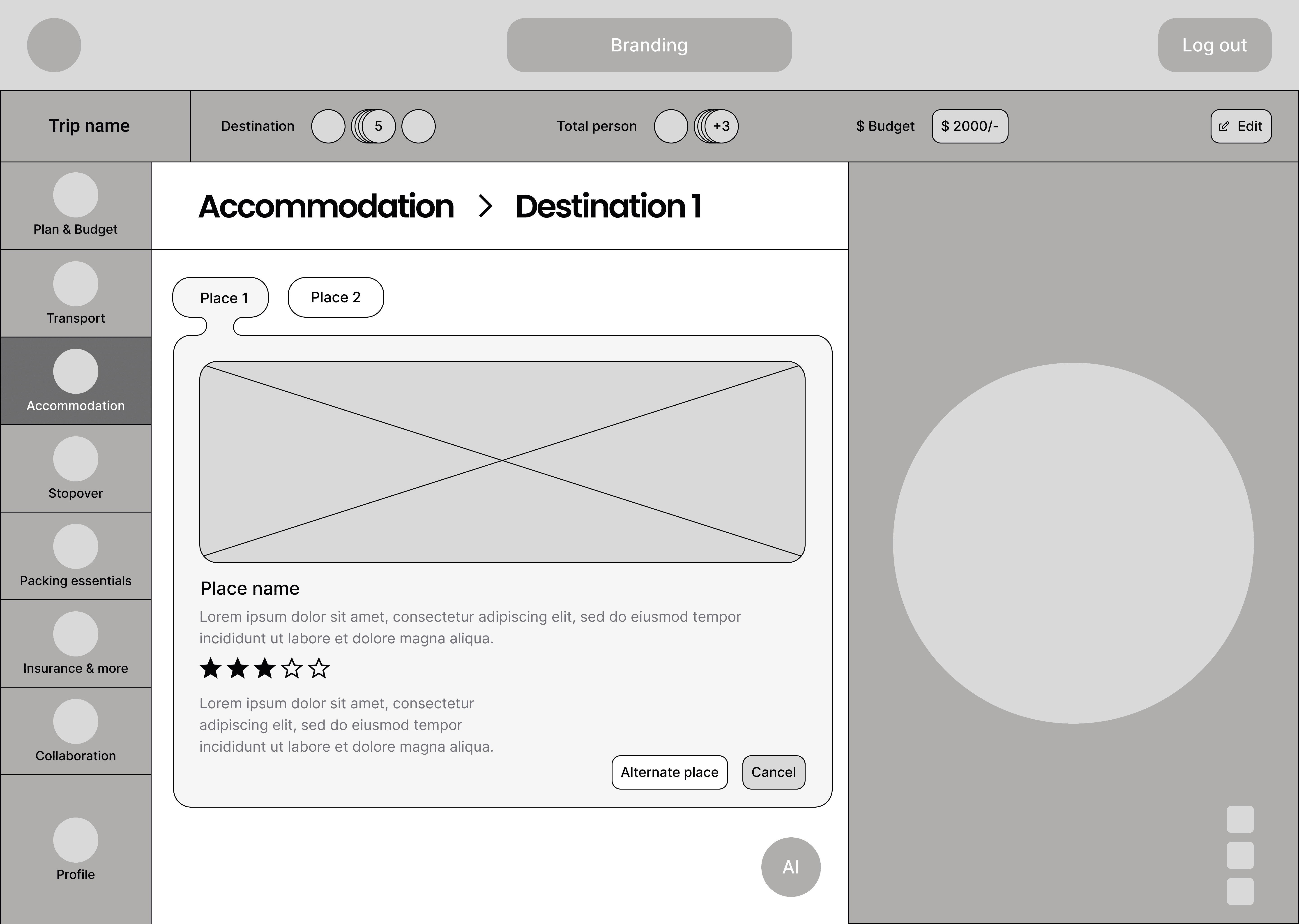
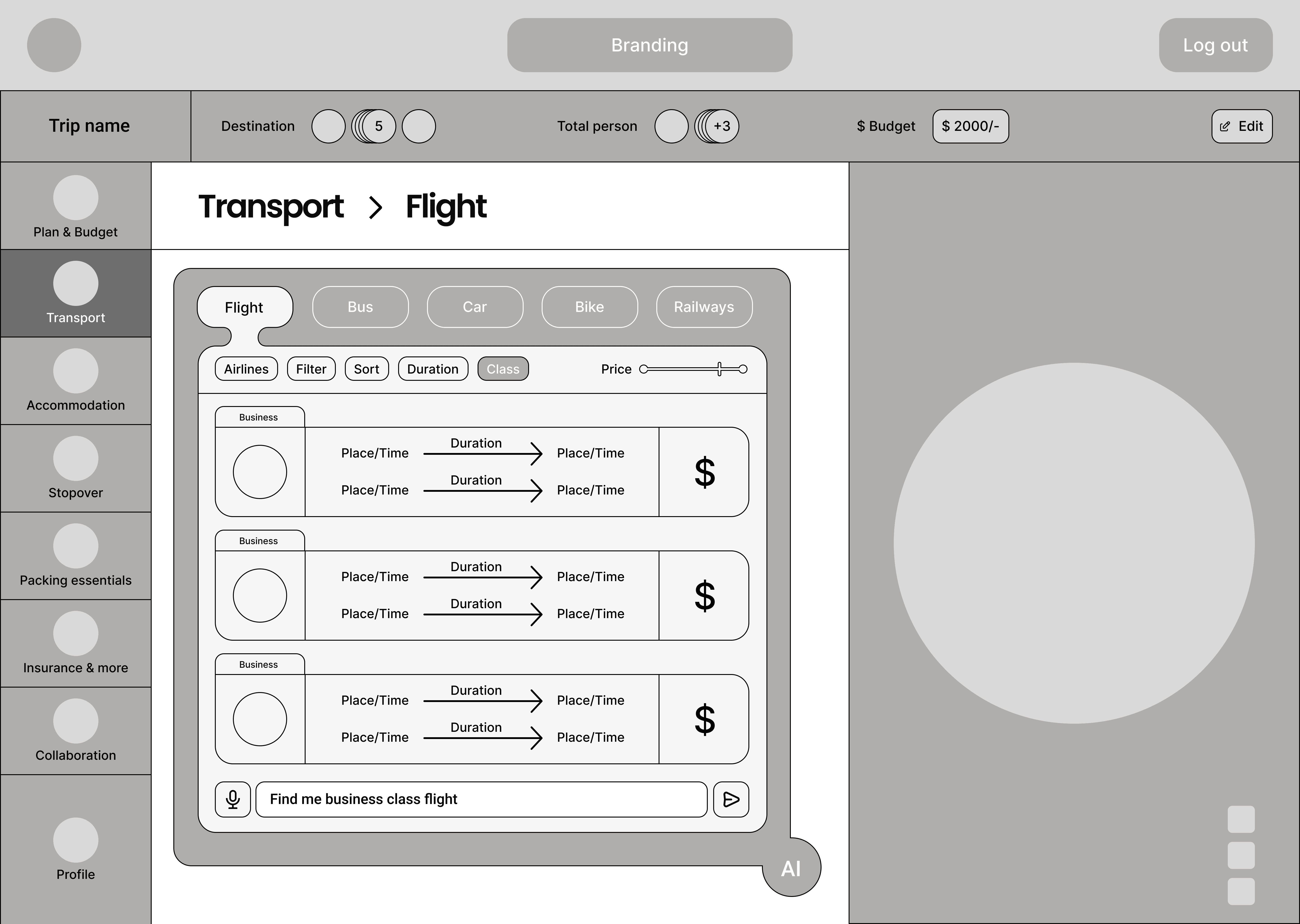
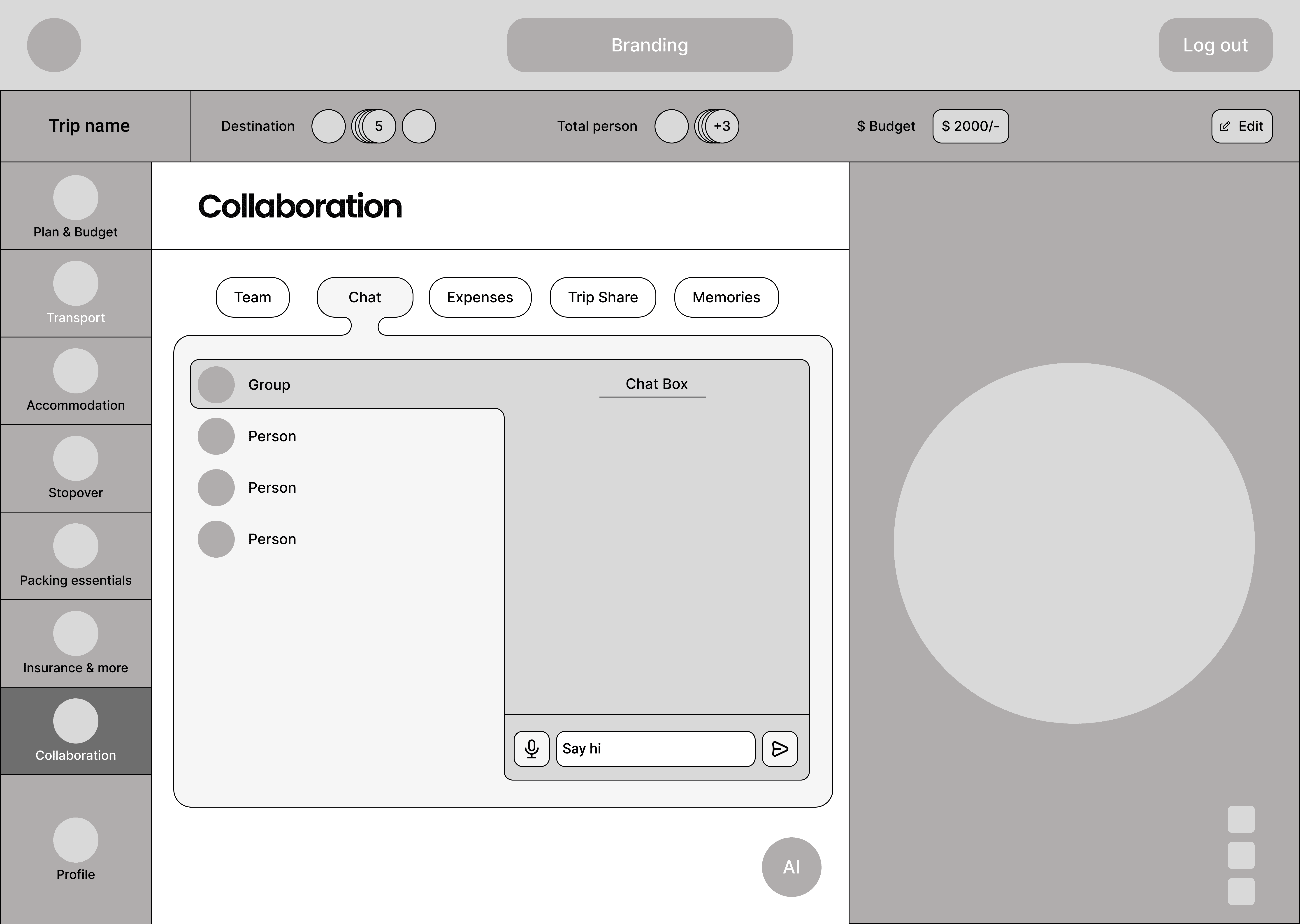
Figure 4. Wireframes for the landing page, accommodation, flights and group collaboration.
What we built.
A traveler enters a start point, stopovers, a destination, dates and a budget, then gets AI-recommended plans that fit. The sidebar holds each part of the trip.
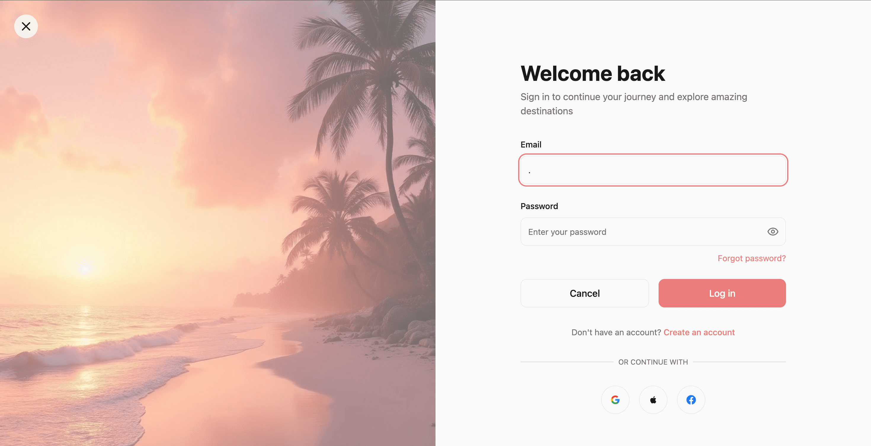
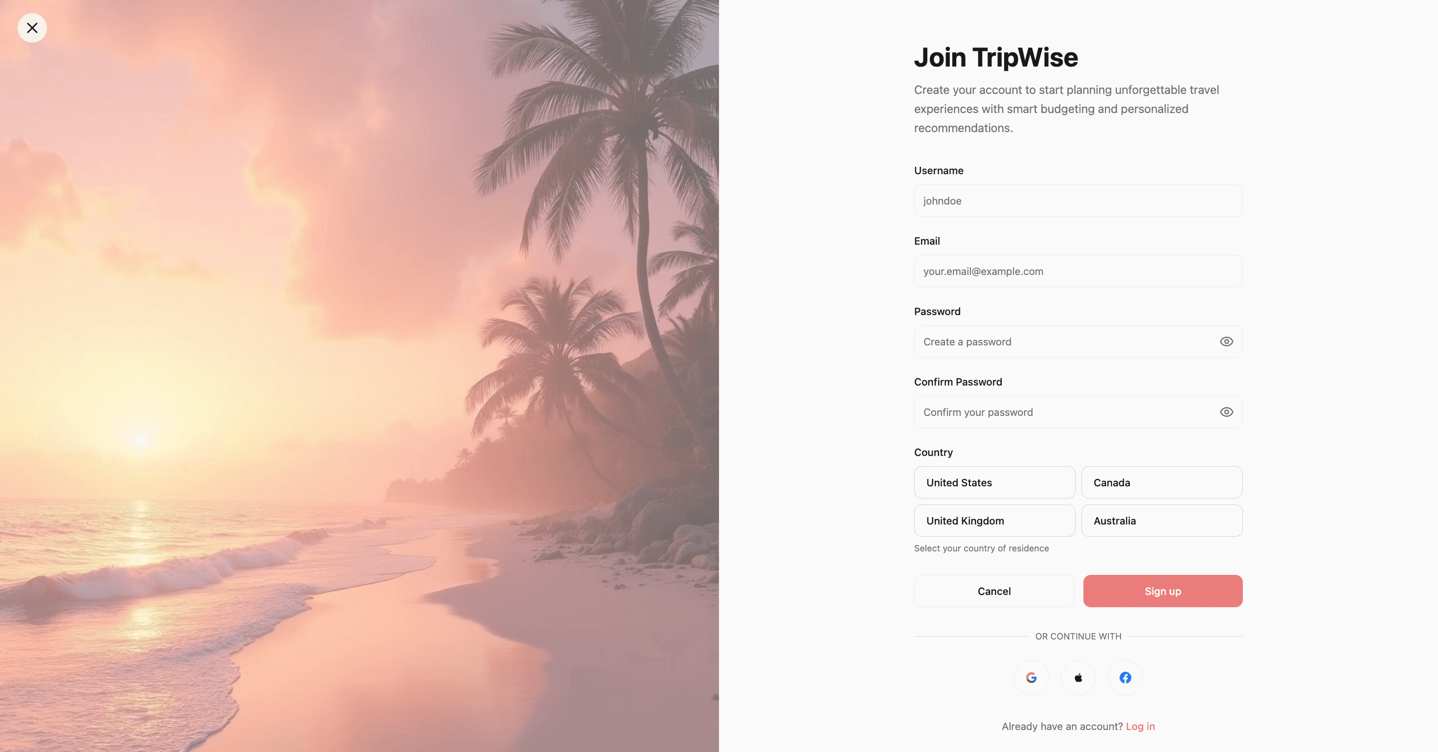
Figure 5. Sign in and sign up screens, with social sign-in offered on both.
Transport
Flights, trains, buses, cars and bikes sit in one flow. Each mode has its own listings and detail pages with a booking step.
Stays and stopovers
Hostels, hotels and motels with ratings and prices. A stopover page suggests places along the route, filtered by activity type.

Figure 6. Stopover activities with an estimated cost for each one.
AI assistant
A chat assistant that reads the current page, the trip details and the option the traveler picked, then suggests alternatives with prices and providers.
Group trips
The collaboration tab lists trip members and splits shared expenses per person. It also sends payment reminders by email, SMS or an in-app message to anyone who owes money.

Figure 7. The collaboration tab: each member’s fair share and who owes whom.
What prototype feedback changed.
We ran feedback sessions on the prototype before the build, and three changes came out of them. TripWise is a working web app we built as a team project. It has no public deployment yet, and we haven’t tested the built version with travelers.
Plan options
Some travelers wanted to see slightly pricier options next to their budget plan. We added AI-generated Budget and Premium plans side by side, so they can compare and switch without restarting the flow.
Group expense reminders
Travelers asked for a way to remind the group about unpaid shares. The collaboration tab now sends payment reminders to members.
Directions to stopovers
People needed clearer directions to each stop. A traveler can now send a stop’s location as a Google Maps link by SMS or email, or show it as a QR code.
Next case study
Tough Talks, a front door for an ASU practice bot
Read the case study →

Anchal Nagdev